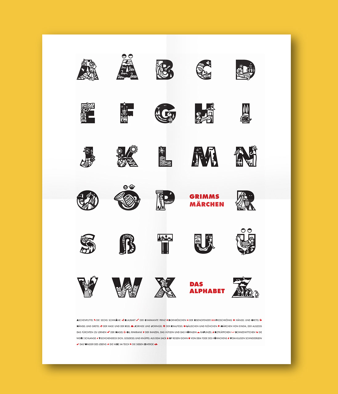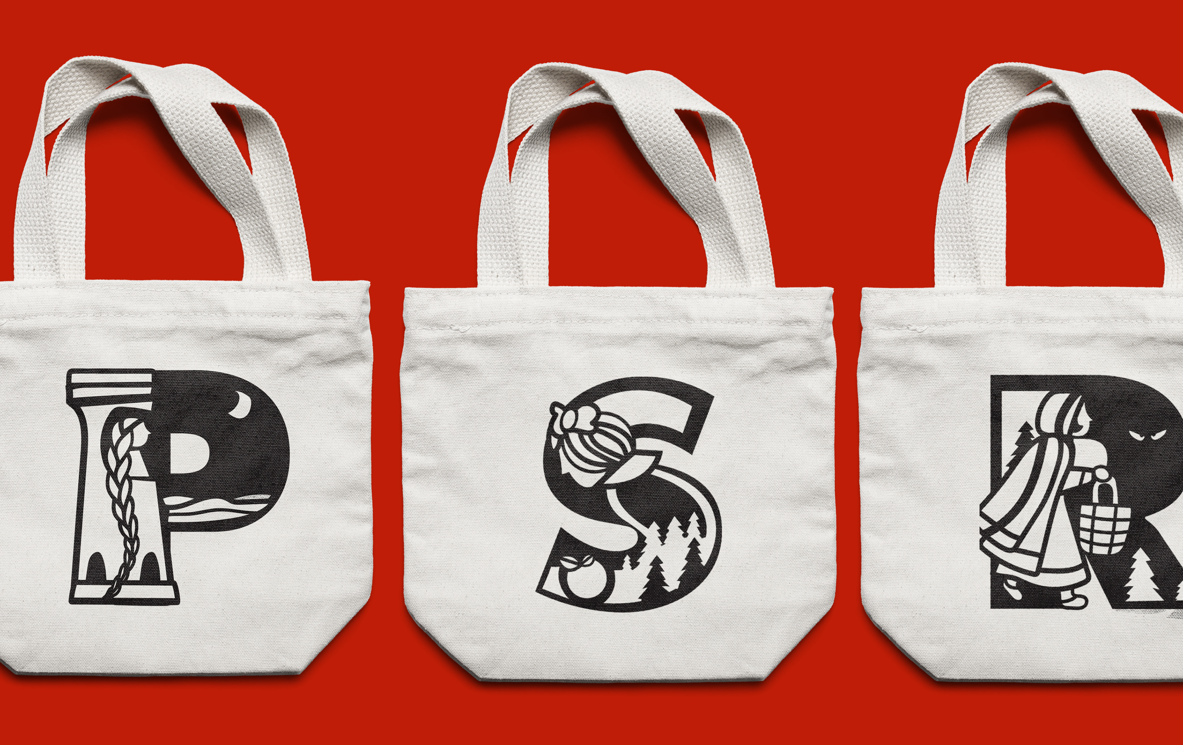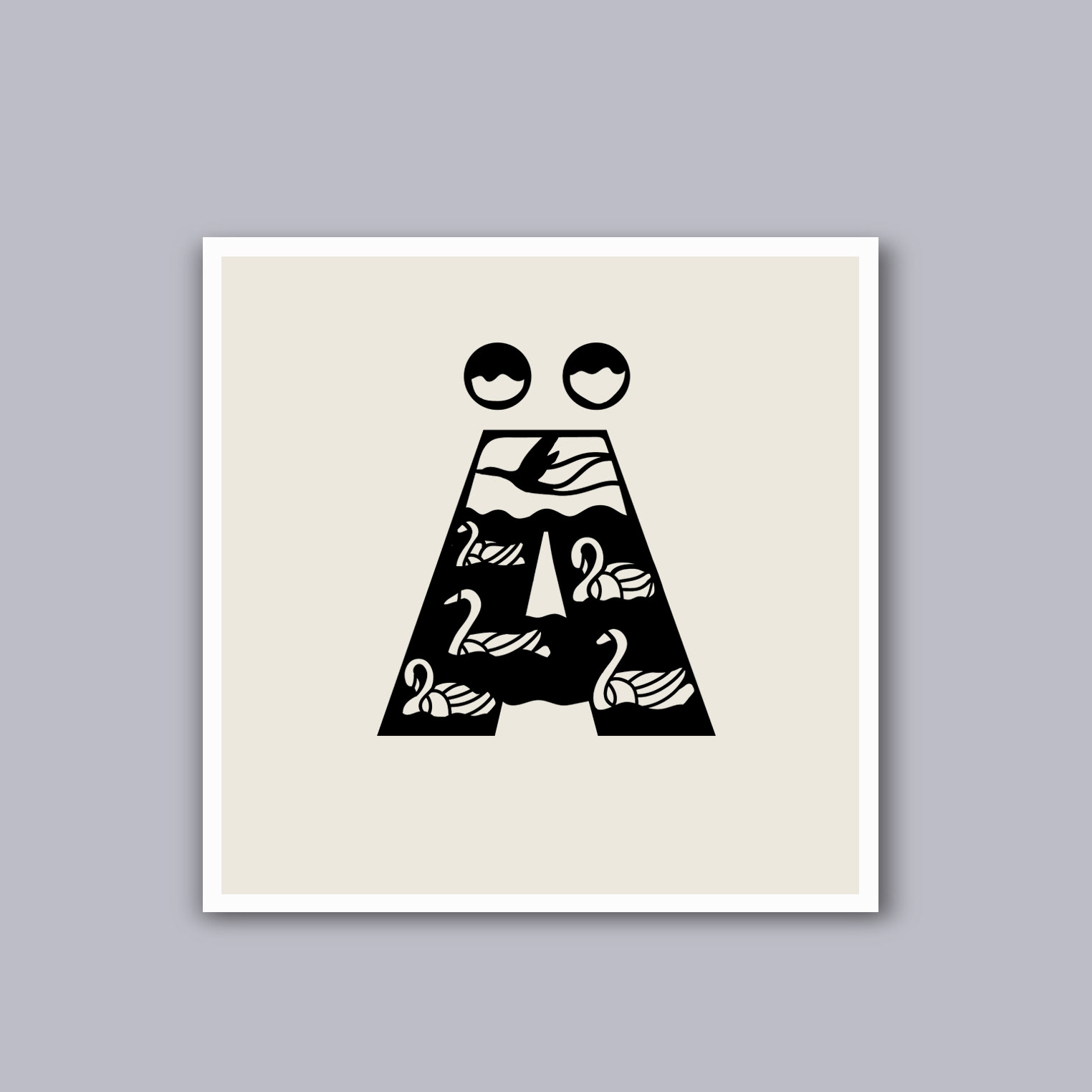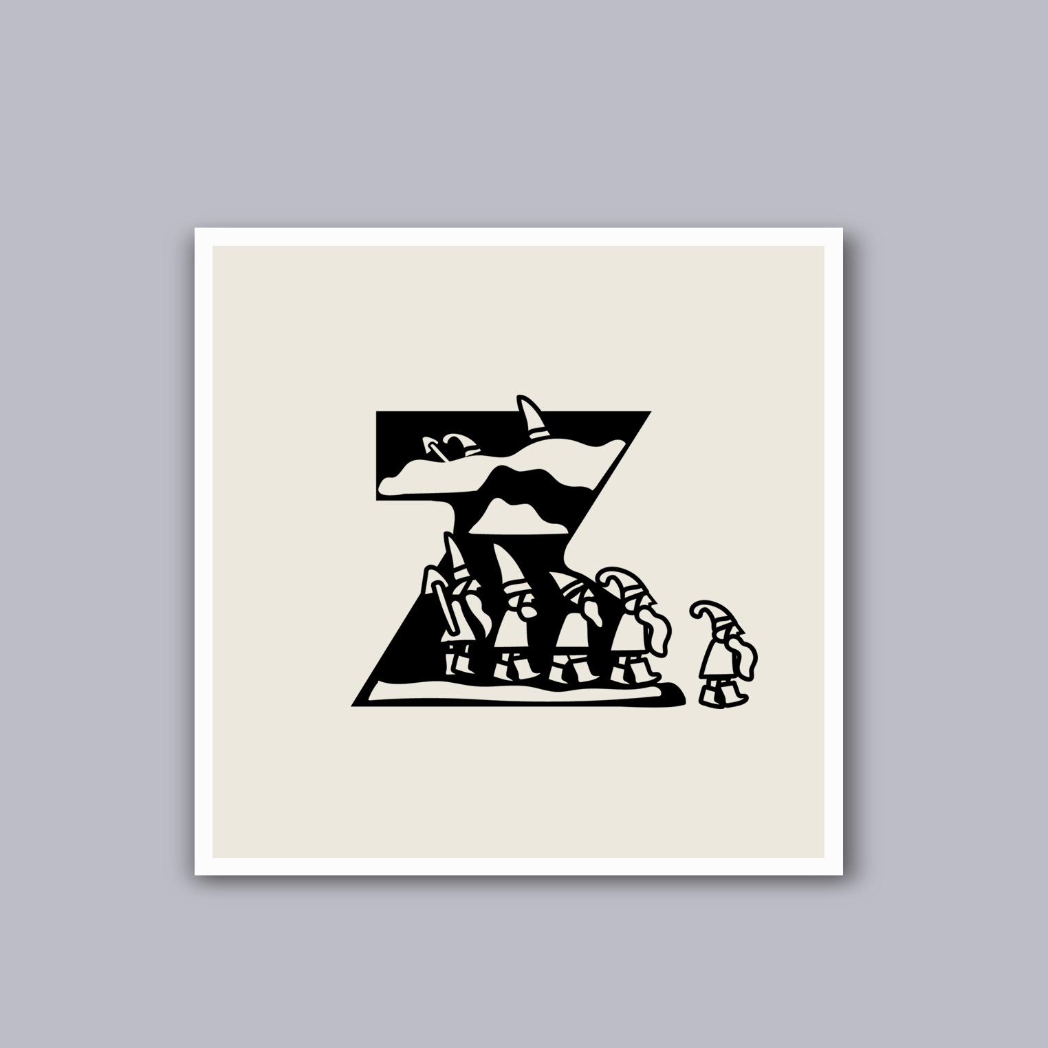


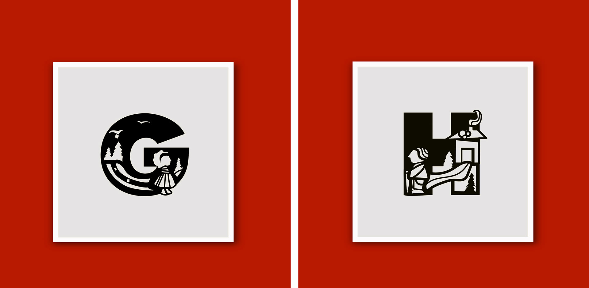
Grimm's Märchen: Das Alphabet, Danke
___
typography, illustration
This 28-letter alphabetical typographic set, Grimm’s Märchen: Das Alphabet, interrelates the concept of historic and cultural use of Scherenschnitte (“scissor cuts: the art of paper-cutting design”) and the German alphabet and its use of typography via the context and content of Grimm’s Brother’s Fairytales. The designs were included as a winner in the 2017 Communication Arts Typography Annual Design competition.
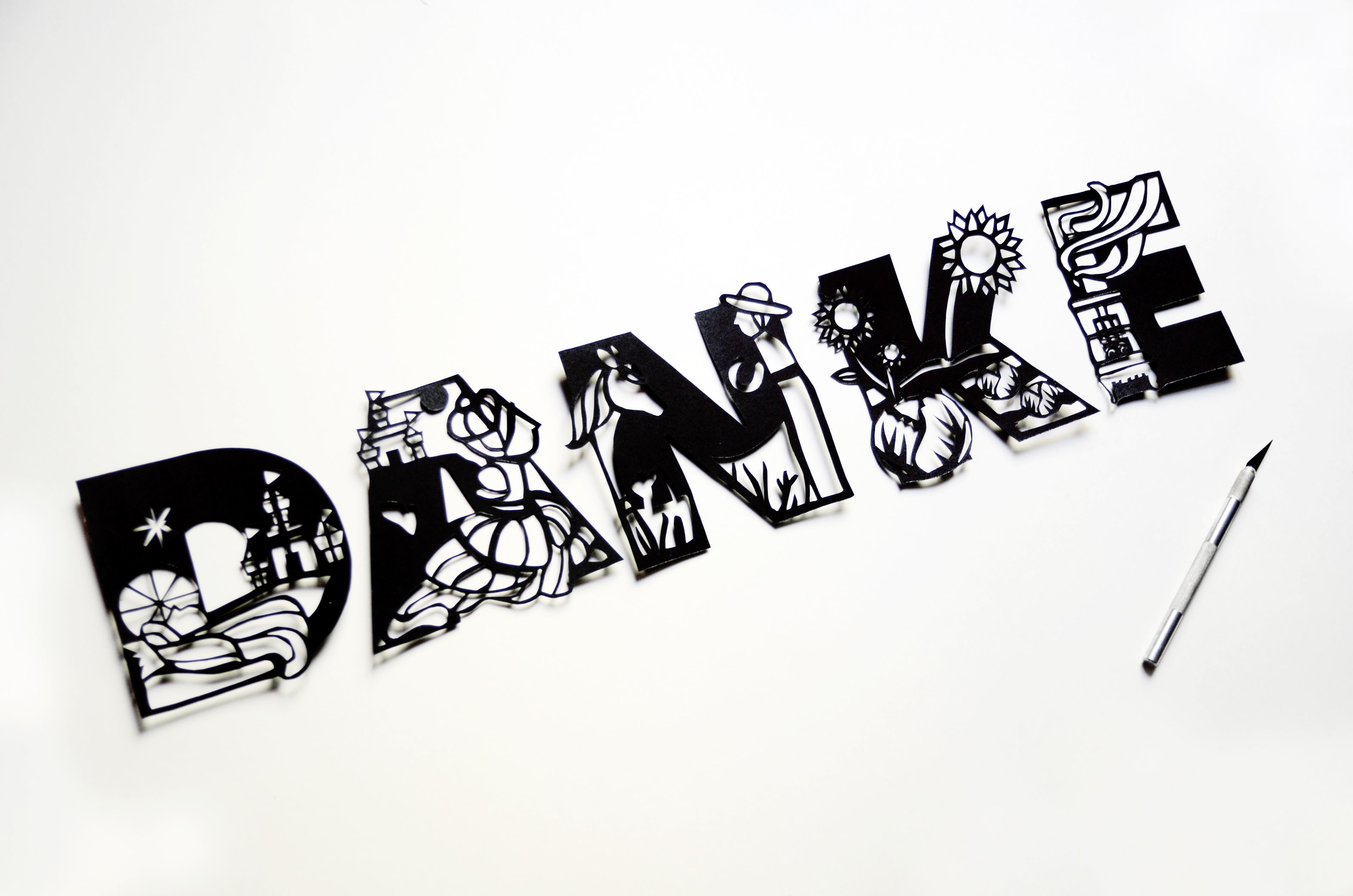
Cultural storytelling is always an influential part of my work, and while traveling in Germany, I was fascinated by the short stories of childhood German folklore and fairytales as they still relate to the common German adult as part of their daily life. Inspired by work from German artist and silhouette animator, Lotte Reiniger, the Hauptstadt A6, Bauhaus typography, and the architecture and cultural diversity drawn between the northern and southern regions of Germany, I formulated these designs by thematically and symbolically narrowing the focus of different stories. This project is showcased on a 24 × 36 print piece. Using the designs for Grimm’s Märchen: Das Alphabet, I applied the use of the Scherenschnitte technique to my own piece Danke.